
Kyoorius Magazine
2010/11
Art Direction, Print, Editorial, Magazine Design
Kyoorius Magazine was a branding, advertising, design and visual communications magazine published bi-monthly by Kyoorius; part of an initiative of Transasia Fine Papers in India. After a short hiatus from the first few issues, the magazine relaunched in 2010.
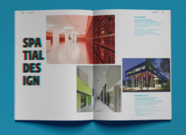
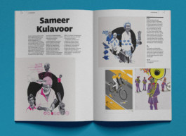
Together with Figtree Design (now Fish Do It / Some Early Birds), we revamped issues 6 and 7. The idea was to have the magazine stand out amidst the clutter of newsstands and bookshelves, hence the minimal layout with purely type on the cover.
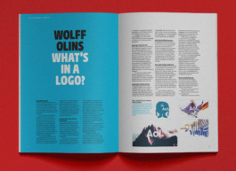


The beautiful Fedra Sans type family is showcased throughout—lending a bold typographic identity; a template they kept with future issues.
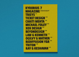
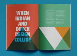
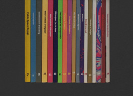
↓ With this formula, Kyoorius took it a step further by utilising each cover as a way to demonstrate different paper variants from Transasia Fine Paper’s collection.
IN COLLABORATION WITH: KAY KHOO ● CLIENT: KYOORIUS INDIA

Kyoorius Magazine
2010/11
Art Direction, Print, Editorial, Magazine Design
Kyoorius Magazine was a branding, advertising, design and visual communications magazine published bi-monthly by Kyoorius; part of an initiative of Transasia Fine Papers in India. After a short hiatus from the first few issues, the magazine relaunched in 2010.
Together with Figtree Design (now Fish Do It / Some Early Birds), we revamped issues 6 and 7. The idea was to have the magazine stand out amidst the clutter of newsstands and bookshelves, hence the minimal layout with purely type on the cover.


The beautiful Fedra Sans type family is showcased throughout—lending a bold typographic identity; a template they kept with future issues.


↓ With this formula, Kyoorius took it a step further by utilising each cover as a way to demonstrate different paper variants from Transasia Fine Paper’s collection.

IN COLLABORATION WITH: KAY KHOO ● CLIENT: KYOORIUS INDIA